Operations teams and executives of contact centers do not need different dashboards because of preference. They need different dashboards because they are responsible for different control loops. When leaders and operators share the same dashboards, organizations confuse activity with performance, introduce noise into decision making, and slow response across the system. The result is not better oversight. It is degraded operating discipline. High-performing contact centers separate dashboards by decision horizon, not by hierarchy.
Dashboards Are Control Surfaces, Not Reports
Most organizations treat dashboards as reporting artifacts. In practice, dashboards function as control surfaces. What people see determines what they react to, how often they intervene, and where accountability settles. Operations dashboards exist to support immediate correction. Executive dashboards exist to support governance, prioritization, and risk management. When those purposes are mixed, both fail. This is not a tooling problem. It is an operating model problem.
Decision Horizon Determines Dashboard Design
Every contact center operates across three decision horizons.
First, real-time control.
Second, short-term stabilization.
Third, long-term governance.
Each horizon requires different information, different resolution, and different tolerance for noise. Problems arise when leaders collapse these horizons into a single view.
The Operations Control Loop
Operations teams are responsible for keeping the system within acceptable bounds right now.
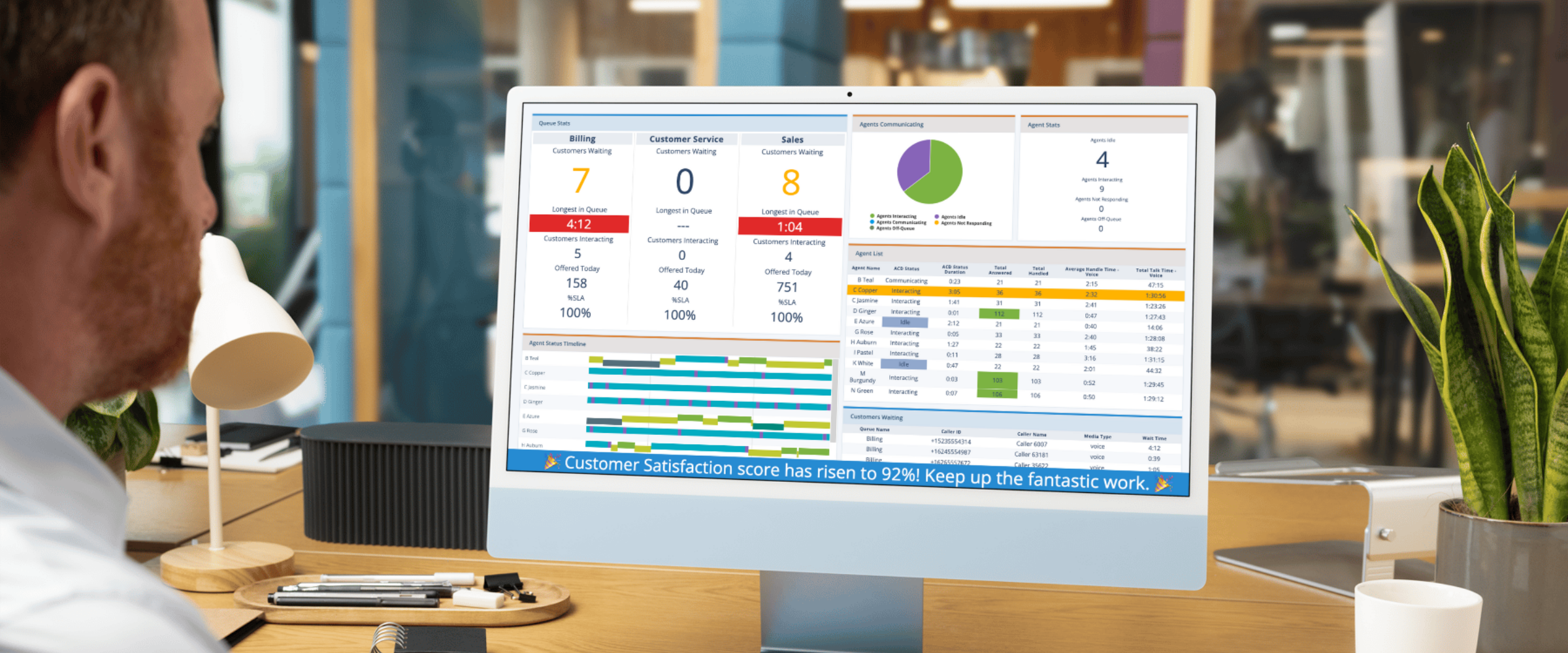
They need dashboards that surface:
-
Queue buildup as it is forming
-
Wait time anomalies by interval
-
Abandonment spikes as they occur
-
Agent availability and adherence
-
SLA breaches that require intervention
These dashboards are designed for action, not explanation. They are volatile by nature. Variance is expected. Overreaction is costly. The question ops dashboards answer is simple: Where do we need to act in the next fifteen minutes?
Case Study: Five Star Call Centers and the Cost of Manual Oversight
Five Star Call Centers used Brightmetrics to give managers real-time visibility into queue health and agent performance.
Before this change, managers spent significant time assembling reports, reconciling conflicting numbers, and reacting late to issues that were already impacting customers.
After implementation:
-
Issues surfaced earlier
-
Accountability clarified
-
Managers saved up to 20 hours per month previously spent on manual reporting and investigation
The improvement did not come from better data alone. It came from placing the right data in the hands of the people authorized to act on it immediately.
The Contact Center Executive Governance Loop
Executives are not responsible for minute-to-minute correction. They are responsible for:
-
Direction
-
Resource allocation
-
Risk management
-
Tradeoff selection
Executive dashboards should therefore emphasize:
-
Trends, not spikes
-
Outcomes, not activity
-
Stability, not immediacy
Metrics commonly reviewed at this level include:
-
Cost per contact trends
-
Abandonment and access reliability over time
-
CSAT movement
-
Staffing efficiency
-
Early indicators of systemic risk
The executive question is not “What is happening right now?” It is “Is the system behaving as intended?”
Case Study: City of Santa Rosa and Executive Clarity Under Pressure
During a major crisis, the City of Santa Rosa faced sudden and sustained increases in contact volume. Leadership needed clear visibility into service continuity and access, not operational noise.
Using Brightmetrics, executives focused on:
-
Wait time trends
-
Abandonment risk
-
Overall system stability
The result:
-
Wait times reduced by 90 percent
-
Faster, more confident executive decisions
-
Clear escalation without micromanagement
This outcome was not the result of executives watching live queues. It was the result of seeing the system clearly enough to govern it effectively.
The Failure Mode of Shared Dashboards
When executives and operations teams consume the same dashboards, several predictable failures emerge.
First, executives are exposed to operational noise. Normal variance appears as risk. Spikes invite reaction. Decisions become reactive rather than intentional.
Second, operations teams lose autonomy. When every fluctuation is visible upward, teams hesitate. Decisions slow. Local judgment erodes.
Third, accountability blurs. If everyone sees everything, ownership becomes unclear. Teams wait for direction rather than acting.
The organization becomes cautious at the exact moment decisiveness is required.
Executive Overexposure Increases Intervention, Not Insight
Executives reviewing real-time dashboards often believe they are gaining transparency. In practice, they are absorbing noise without context.
This leads to:
-
Shadow priorities
-
Metric re-litigation
-
Ad hoc requests
-
Exception handling that becomes the norm
Operations teams respond by optimizing for visibility rather than outcomes. The dashboard begins to drive behavior rather than inform it. This is how micromanagement emerges without intent.
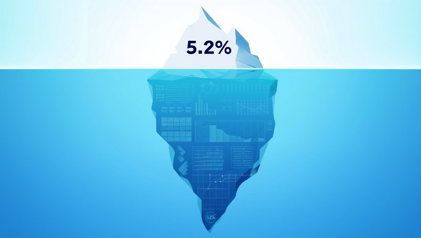
Industry Context Shapes Dashboard Discipline
Dashboard separation is not optional. Its expression varies by industry. In healthcare, operations dashboards focus on access reliability and queue buildup. Executive dashboards emphasize patient access trends and risk exposure. In logistics and transportation, operations dashboards prioritize time-of-day spikes and routing anomalies. Executives monitor SLA stability and cost efficiency. In the public sector, operations dashboards focus on surge response. Executive dashboards emphasize equity, transparency, and continuity of service. Attempting to standardize dashboards across roles ignores the realities of decision authority.
Metrics That Should Never Appear on Executive Dashboards
Certain metrics lose meaning at the executive level.
These include:
-
Real-time agent status
-
Interval-level queue depth
-
Short-term adherence variance
When executives see these metrics, they feel compelled to react. That reaction introduces friction without improving outcomes.
If a metric requires immediate action, it belongs with the team empowered to act immediately.
How High-Performing Organizations Separate Visibility
High-performing contact centers follow consistent patterns.
- They design dashboards around decision cadence, not organizational chart.
- They restrict real-time operational metrics to operations and management.
- They present executives with curated trend views that emphasize movement, stability, and risk.
- They review dashboards on a fixed rhythm and resist ad hoc escalation driven by noise.
- They treat dashboards as part of governance, not transparency theater.
Decision Rules That Prevent Dashboard Drift
Several simple rules hold under pressure.
- If a metric changes meaning at different time scales, do not show it to everyone.
- If a dashboard invites reaction without authority, redesign it.
- If executives are asking questions that operations dashboards answer, the governance view is incomplete.
- If operations teams delay action because of executive visibility, the dashboard boundary has failed.
Brightmetrics and Role-Based System Visibility
Brightmetrics is not a single dashboard. It is a system that supports role-appropriate visibility. Operations teams use Brightmetrics for real-time control and short-term stabilization. Executives use Brightmetrics for trend analysis, risk identification, and performance governance. By separating visibility by decision horizon, Brightmetrics allows organizations to move faster without losing alignment.
Learn more:
https://brightmetrics.com
Final Observation
Dashboards do not create alignment by showing everyone everything. They create alignment by showing each role what it needs to decide well. Organizations that understand this distinction operate with less noise, faster response, and greater trust across levels.