You Have Numbers on the Wall. Most of the Time, They Are Background Noise.
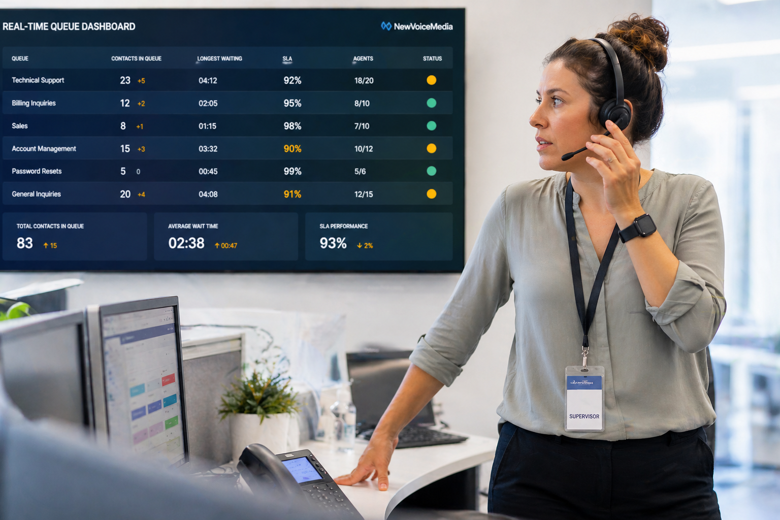
Walk into most contact centers and you will find a screen displaying metrics. Queue depth, service level, calls waiting, agents available. Green numbers, yellow numbers, sometimes red.
Most of the time, no one is really looking.
This is not because the people are disengaged. It is because most wallboards were never actually designed. They came configured with the platform defaults, nobody was tasked with building them intentionally, and over time the display became wallpaper. Agents glance at it occasionally. Supervisors check it when something feels obviously wrong. The rest of the time, it is background noise.
That is not what a wallboard is supposed to do. A well-designed wallboard changes behavior. Agents who can see real-time queue depth adjust their pace. Supervisors who see a metric trending toward yellow intervene before it turns red. When someone is watching a live queue back up in real time, they act. When the wallboard is just a screen on the wall with numbers that may or may not mean something, they do not.
The difference comes down to a few design decisions most operations get wrong.
The Most Common Wallboard Mistakes
Too Many Metrics
If 15 numbers are on the screen at once, the brain cannot process what matters. Everything competes for attention and nothing wins. The result is that people stop looking, which means supervisors miss the window to intervene before service level breaks and problems do not get caught until they are obvious.
A wallboard should display the four to six metrics that most directly reflect whether the operation is running well right now. Not everything the system can show. The things that should change behavior when they move.
No Context for What Good Looks Like
A number without a target is nearly impossible to act on. Is a service level of 74 percent good or bad? It depends entirely on your target. A wallboard that shows the metric alongside the target, and visually signals whether you are above or below, is far more useful than one that just shows the number.
Color coding tied to real thresholds, not arbitrary platform defaults, is one of the most practical changes most operations can make immediately. Without it, colors become decorative rather than directional.
Static Displays That Never Change
A wallboard that looks the same every day stops getting noticed. The brain filters out things that do not change. Wallboards should reflect the current moment and update frequently enough that agents and supervisors trust that what they are seeing is real.
One Display for Everyone
Agents and supervisors need different information. An agent needs to see queue depth, their personal metrics, and maybe team performance. A supervisor needs queue health, SLA status, and agent availability. A single wallboard trying to serve both audiences usually serves neither well.
What Makes a Dashboard Actually Useful
Imagine this: a supervisor sees wait times trending up on the billing queue at 10 AM. The wallboard shows it clearly. She has time to pull an available agent from a lower-volume queue before service level breaks. She does not have to wait for someone to tell her there is a problem. She sees it in real time and acts.
That is what a useful dashboard enables. But it only works if the right metric is visible, tied to a meaningful threshold, and updated frequently enough to be trusted.
The same principles apply to manager and executive dashboards, just with different metrics and a different time horizon.
A supervisor dashboard should answer: is my team running well right now, and if not, where do I need to focus?
A manager dashboard should answer: did yesterday run as expected, and are there trends I need to act on this week?
An executive dashboard should answer: is the operation performing at an acceptable level, and are there risks or opportunities I need to be aware of?
Each of those is a different dashboard. Building one dashboard that tries to serve all three audiences produces a dashboard that works well for none of them.
Practical Design Principles
Start with fewer metrics than you think you need. You can always add. Removing metrics from a dashboard that people are already watching is harder than starting lean.
Use visual hierarchy. The most important metric should be the largest and most prominent. If everything is the same size, nothing is prioritized.
Tie colors to real thresholds. Work with your team to define what green, yellow, and red actually mean for each metric based on your operation’s specific performance expectations, not software defaults.
Build separate views for separate audiences. Agents, supervisors, managers, and executives all have different information needs.
Review and update regularly. A dashboard built six months ago reflects what mattered six months ago. As priorities shift, the dashboards should too.
Frequently Asked Questions
What metrics should be on a contact center wallboard? Service level, calls waiting, average wait time, agents available, and abandonment rate are the core real-time metrics. Some operations add oldest call in queue or queue-specific SLA status. The right answer depends on what your supervisors most need to see to manage the floor in real time.
How often should contact center dashboards be updated? Real-time wallboards should update every 15 to 30 seconds. Manager dashboards can refresh every few minutes. Executive dashboards are typically reviewed daily or weekly and do not need real-time refresh.
How do you get agents to pay attention to wallboards? Make the metrics directly relevant to their work. If agents can see their personal performance alongside team performance, the wallboard becomes useful to them individually. Tie the metrics to the goals agents are actually measured on.
Can you build different dashboards for different roles? Yes, and you should. Brightmetrics lets you build multiple customized dashboards for different audiences, each showing the metrics most relevant to their role.
The Bottom Line
A wallboard that no one pays attention to is not a visibility tool. It is furniture.
Dashboards and wallboards that change behavior are built around specific audiences, specific questions, and specific thresholds that make it immediately obvious whether the operation needs attention. Brightmetrics makes it practical to build those views for any audience without technical expertise.